Spatial Plotting
Author: Clarence Mah | Last Updated: Dec 23, 2024
We will demonstrate spatial visualization in bento-tools for exploring subcellular biology.
A Brief Overview
In bento-tools we provide a high-level interface based on matplotlib for plotting spatial transcriptomics formatted as an AnnData object. See more details about the data structure here. Data is represented as points and shapes, corresponding to molecules and segmentation masks. We closely mirror the seaborn package for mapping data semantics, while replicating some geopandas plotting functionality with styles more suitable for visualizing subcellular data. For spatial visualization at the tissue level (i.e. plotting cell coordinates instead of cell boundaries) we recommend using squidpy and scanpy instead.
Note
In general, plotting in bento-tools assumes datasets will have data stored from multiple fields of view (fov), which must be encoded in adata.obs["batch"]. The plotting functions plot a single fov at a time, which can be set with the batch parameter; if unspecified, the default is inferred from the first cell in adata.
If available, cell and nuclear shapes are plotted by default. Plot more shape layers by passing their names in a list to the shapes parameter.
Load Libraries and Data
import bento as bt
import matplotlib.pyplot as plt
import matplotlib as mpl
sdata = bt.ds.sample_data()
sdata
SpatialData object with:
├── Points
│     └── 'transcripts': DataFrame with shape: (<Delayed>, 7) (2D points)
├── Shapes
│     ├── 'cell_boundaries': GeoDataFrame shape: (14, 3) (2D shapes)
│     └── 'nucleus_boundaries': GeoDataFrame shape: (12, 2) (2D shapes)
└── Table
      └── AnnData object with n_obs × n_vars = 14 × 135
    obs: 'cell_boundaries', 'region'
    uns: 'spatialdata_attrs': AnnData (14, 135)
with coordinate systems:
▸ 'global', with elements:
        transcripts (Points), cell_boundaries (Shapes), nucleus_boundaries (Shapes)
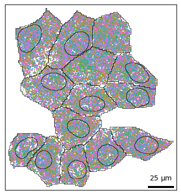
Plotting points
Let’s plot the points (RNA) as a scatterplot in 2D. This is a lightweight wrapper around sns.scatterplot. Refer to the seaborn documentation for more details.
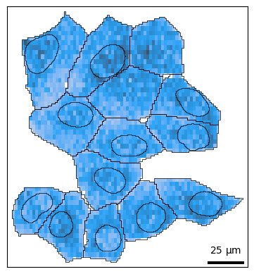
bt.pl.points(sdata)
You can use hue to color transcripts by their gene identity. In this case there are >9000 genes, so it isn’t very informative; you can also hide the legend with legend=False.
bt.pl.points(sdata, hue="feature_name", legend=False)
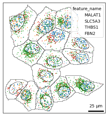
If you have certain genes of interest, you can slice the adata object for that subset.
genes = ["MALAT1", "SLC5A3", "THBS1", "FBN2"]
bt.pl.points(sdata, hue="feature_name", hue_order=genes)
Plotting distributions
Often it may be more useful to look at how molecules are distributed rather than individual points. The density() function wraps sns.histplot and sns.kdeplot, which is specified with kind='hist' and kind='kde' respectively.
Plot 2D histogram of points:
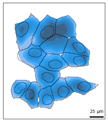
bt.pl.density(sdata)
Plot 2D kernel density estimate of points:
Note
Density plots are not recommended for a large number of points; plotting will be extremely slow.
bt.pl.density(sdata, kind="kde")
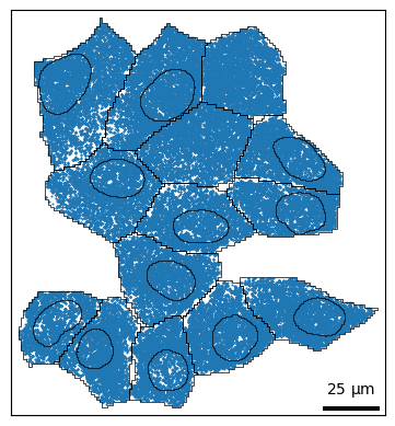
Plotting shapes
For finer control over plotting shapes, you can use bt.pl.shapes(). Similar to above, cells and nuclei are shown by default. This function wraps the geopandas function GeoDataFrame.plot().
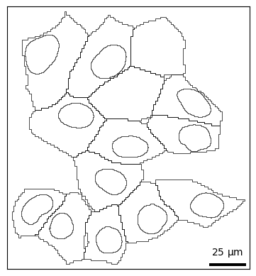
bt.pl.shapes(sdata)
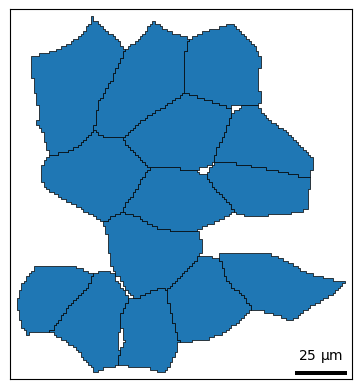
For convenience, shapes() provides two coloring styles, color_style='outline' (default) and color_style='fill'.
bt.pl.shapes(sdata, color_style="fill")
You can use the hue parameter to color shapes by group e.g. cell, cell type, phenotype, etc.
bt.pl.shapes(sdata, hue="cell", color_style="fill")
You can also layer shapes on top of each other in the same plot. This allows you to style shapes differently; for example we can highlight the nucleus with color and the cell membrane with a dashed line.
fig, ax = plt.subplots()
bt.pl.shapes(sdata, shapes="cell_boundaries", linestyle="--", ax=ax)
bt.pl.shapes(
    sdata,
    shapes="nucleus_boundaries",
    edgecolor="black",
    facecolor="lightseagreen",
    ax=ax,
)
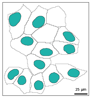
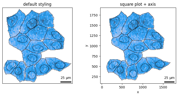
Figure aesthetics
To declutter unnecessary plot elements, you can use these convenient parameters:
axis_visible: show/hide axis labels and ticksframe_visible: show/hide spinessquare: makes the plot square, useful for lining up multiple subplotstitle: defaults to thebatchname, override with your own title
For example, to make a square plot with axis labels and spines:
fig, axes = plt.subplots(1, 2, figsize=(8, 4))

bt.pl.density(sdata, ax=axes[0], title="default styling")

bt.pl.density(
    sdata,
    ax=axes[1],
    axis_visible=True,
    frame_visible=True,
    square=True,
    title="square plot + axis",
)
plt.tight_layout()
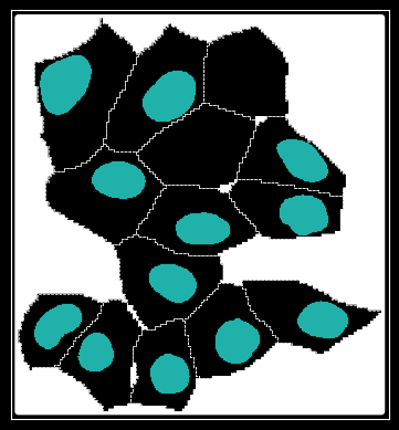
You can even plot cell/nuclei in dark mode:
with mpl.style.context("dark_background"):
    fig, ax = plt.subplots()
    bt.pl.shapes(sdata, shapes="cell_boundaries", linestyle="--", ax=ax)
    bt.pl.shapes(
        sdata,
        shapes="nucleus_boundaries",
        edgecolor="black",
        facecolor="lightseagreen",
        ax=ax,
    )
Building subplots
Since all plotting functions operate on matplotlib.Axes objects, not only can you build plots layer by layer, you can create multiple subplots.
Note
Subsetting SpatialData objects is still a tedious process, and we plan to implement a more user-friendly interface in the future.
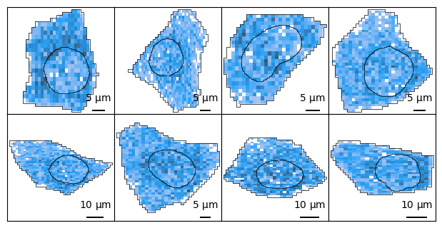
You can tile across individual cells:
import spatialdata as sd
cells = sdata["cell_boundaries"].index.tolist()  # get some cells
ncells = len(cells)

ncols = 4
nrows = 2
ax_height = 1.5
fig, axes = plt.subplots(
    nrows, ncols, figsize=(ncols * ax_height, nrows * ax_height)
)  # instantiate

for c, ax in zip(cells, axes.flat):
    cell_bounds = list(sdata["cell_boundaries"].loc[c].geometry.bounds)
    cell_sdata = sd.bounding_box_query(
        sdata,
        axes=["x", "y"],
        min_coordinate=cell_bounds[:2],
        max_coordinate=cell_bounds[2:],
        target_coordinate_system="global",
    )

    bt.pl.density(
        cell_sdata,
        ax=ax,
        square=True,
        title="",
    )

plt.subplots_adjust(wspace=0, hspace=0, bottom=0, top=1, left=0, right=1)